How many tools do you use to collect data? These days, it’s common for SaaS companies to use an ever-growing list of tools and platforms to collect data. Often, this data ends up scattered across different locations, which makes learning and analyzing this data challenging.
Increasingly, our Databox customers who use ChartMogul for their subscription analytics have been asking us to build a bridge between our platforms. So we did!
You can now send metrics directly from ChartMogul into Databox’s business analytics platform. This allows you to combine the subscription analytics you get from ChartMogul with product analytics, marketing analytics, or any other metrics from the platforms you have connected to Databox. This integration empowers you to monitor your SaaS metrics and visualize key insights in real time, all in the same place.
Using ChartMogul with Databox
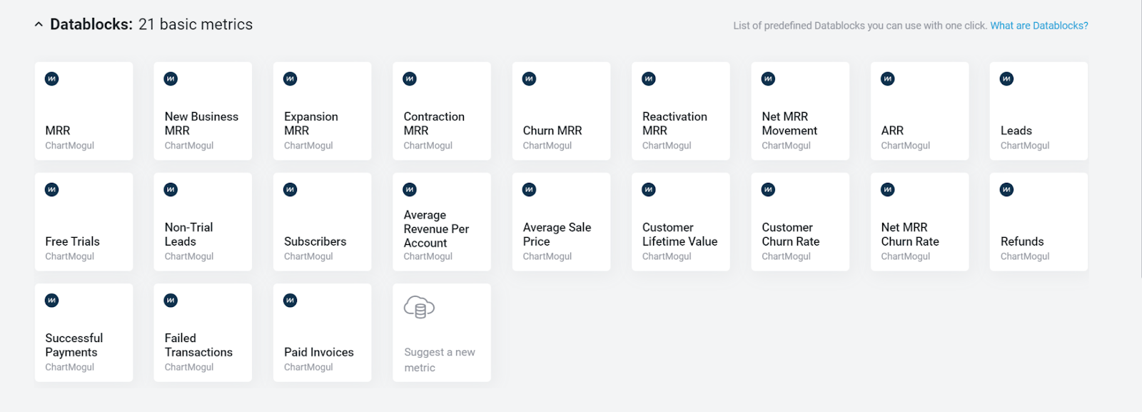
When you connect ChartMogul as a Data Source in Databox, 36 months’ worth of historical data is initially synced, and you have access to 21 basic metrics.
From there, you can add specific metrics to your dashboards, or combine ChartMogul metrics with other data from other integrations, all in a single dashboard.
The team at Databox has built a free ChartMogul Dashboard Template to help you get started with bringing metrics from across your company into one place.
But getting your data in one place is just the beginning. Analyzing this data is the real opportunity, and there are some key lessons you need to know to make strong data-informed decisions.
Understand the Difference Between Correlation and Causation
The best way to explain this would be through a common example in the SaaS industry:
We have just launched a new feature thinking that our churn so far was because that feature was the missing link in our product. So, we keep monitoring our data, and within four months, we see a significant drop in churn: 20%. The natural conclusion: The new feature helped.
Here’s where we need to be careful.
What we didn’t look at was the adoption of the said feature. Say, less than 10% of users have activated it.
What can we conclude now? Yes, the new feature contributed to lowering the churn, but not enough to justify this new trend. This means we need to continue analyzing the data. Other factors could be relevant. Likewise, a possibility, however, is that the trend was a part of random data fluctuations. It’s important to stay vigilant both about unexpected factors driving trends and not mistaking the noise for the signal.
This is the most practical explanation of why we must understand the difference between correlation and causation. So remember—don’t assume a connection without conducting more research.
Ensure Your Data Is Reliable and Accurate
Quality data analysis requires both enough data and quality data. But how much is enough? For our purposes: more is better.
A small data sample can lead to false conclusions and chasing phantom trends. Building a robust data pipeline ensures that your data sample size is adequate.
Data quality is even more important. Garbage in, garbage out, as they say. You can have the most subtle analysis, effective metrics, and ingenious visualizations, but it’s all for nothing if they are built on inaccurate data.
Ensuring data quality is challenging. Especially from multiple sources with their own formats. Plus, it could be skewed in processing, have missing values, or simply be outdated, which puts you in the unfortunate position of checking yesterday’s weather to decide if you should take along an umbrella today.
By paring up with integrations like ChartMogul that have the critical role of providing SaaS companies with precise (normalized) subscription data, meticulously calculated according to industry-leading SaaS metrics, Databox is ensuring that our users can always rely on the numbers they see in their dashboards and scorecards.
Focus on The Right Benchmarks for Comparison
Naturally, you want to know how you are doing in comparison to the other SaaS companies. You have your KPIs and metrics and want to compare them to the industry standard. ChartMogul offers expert SaaS Growth and SaaS Benchmarks reports with the latest data from over 2,200 SaaS businesses.
The data you find in these reports can be a great asset in assessing where the Saas Industry is currently and what are the latest growth trends, insights, and benchmarks.
If you want to go even deeper and get benchmark data for your niche and company size, it’s important to focus on finding benchmarks that offer median values you can compare yourself to. For example, a benchmark group for Google Analytics 4 (GA4) for SaaS & B2B Companies can provide you with graphs similar to this one. And data in the Benchmarks Group is updated in real-time.
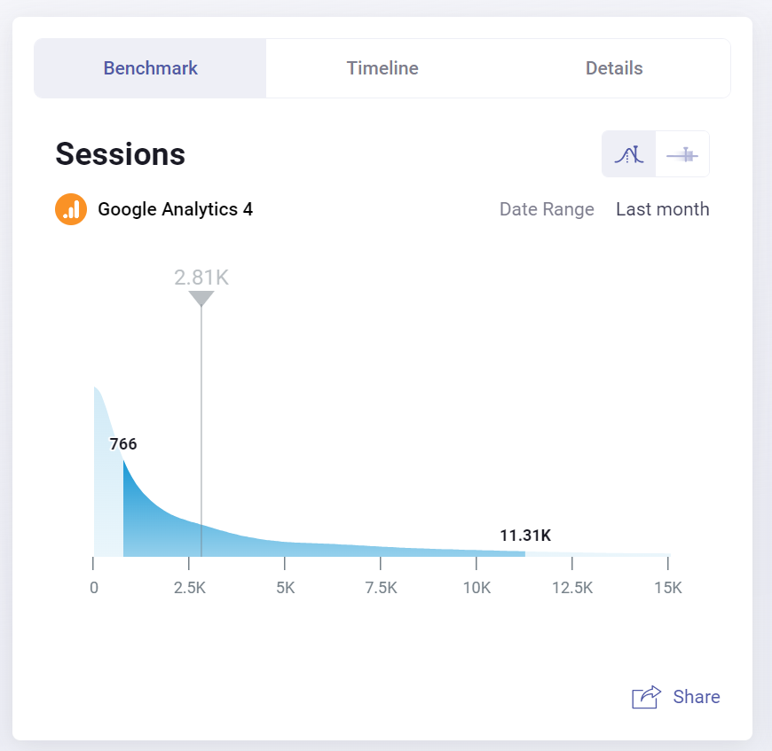
This group has over 3000 contributors, all SaaS B2B companies and the median value for September 2023 for Sessions was 2.81k. Now, if you look at your sessions, you can see where you are and, if needed, take the necessary steps towards improvement.
In addition, you can adjust the date range to add more context and see the latest trends.
Present Results with Adequate Context
So you have done everything by the book, collected accurate and reliable data, and made sure it is correctly visualized and interpreted, now, all that is left is to present the results.
For that, we need context.
We can’t just share a metric and go, “Here is your data. As you can see, your Income year-to-date has been $8,768.00.”
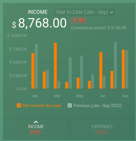
In this situation, we need to present the context and first mention which months were better and which were worse based on the data from last year. Then, have an explanation ready for possible changes, whether it is an increase in subscriptions or if there were unforeseen expenses, for example, in April.
This way, we help our data tell a story. You can even use report automation software to help you repeat the process more easily.
The Power of Data Analysis
There is no replacement for data analysis. Without it, any business, from a micro startup to a multinational conglomerate, is working blind and is unlikely to make the most of growth opportunities. With it, however, a business can see where it was, where it is going, how it is doing, and make informed data-driven decisions that optimize for company goals.
As powerful as it is, data analysis can also be dangerous: trustworthy, vital business intelligence and dangerously misleading guesswork look the same on a dashboard. If not done well and with care, data analysis can become just an automated, highly efficient tool for self-deception.
This is why it is important to work with reliable sources of data, using trusted and tested tools, and well-chosen and deployed approaches. Only then can you avoid all the pitfalls of data analysis and reap all its benefits.
About Databox
Databox is a cloud-based business analytics platform for marketers, CEOs, analysts, and decision-makers that provides a single interface to view various KPIs, generate reports, and forecast future performance. It is suitable for both SaaS and B2B companies.
The new integration with ChartMogul empowers you to effortlessly monitor your SaaS metrics and visualize key insights in real time, all in one place.
To discover how this integration works and try it out, see the ChartMogul integration overview.