Ever since reading Tomasz Tunguz’s article about negative churn I fell in love with the layer cake cohort charts – it’s the clearest way I’ve seen to visualise the impact of churn and account expansion over time.
We’ve been waiting for the right time to build this capability into ChartMogul, and today I’m excited to announce that it’s available.
What’s new?
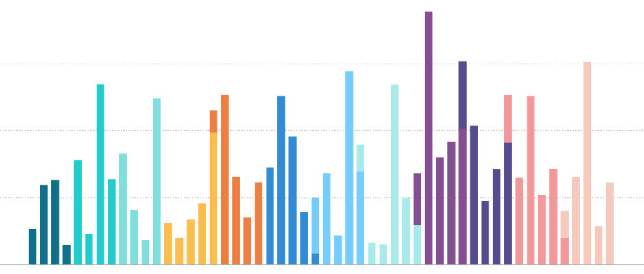
Bar charts!
Any chart can now be switched between a line or a bar chart.
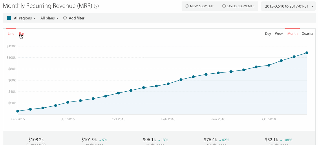
You can also change any of the charts on your Overview dashboard to bar charts, just go into “Edit mode” on the Overview screen (Admin only) > click “Edit” on a chart and you will see the option to choose the chart type.
Stacked charts!
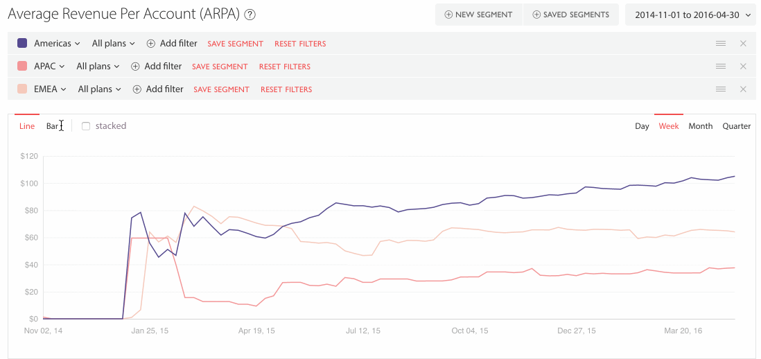
When you’re comparing more than one segment you can toggle ‘stacked’ mode. This is the killer feature that makes it possible to build layer cake style cohort analyses.
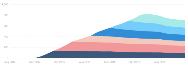
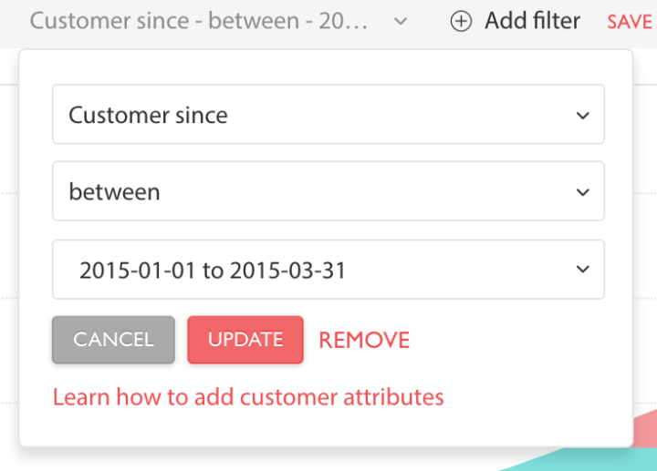
This report was built by creating a separate segment for each quarter with a filter like this: “Customer since – between – 1st Jan 2015 and 31st March 2015”, etc.
There’s one more thing…
You can also change the order your segments are rendered on the chart using drag and drop
It can also just be fun!
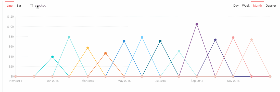
This analysis of average sale price doesn’t give us any new insights, but it looks pretty.
I hope you enjoy this new capability within ChartMogul, if you have any questions or feedback please shoot us an email to support@chartmogul.com.