Announcing a colorful update to Segmentation
At ChartMogul we’re excited to continue enhancing our product to make it that much easier to measure, understand, and grow your subscription business. Since launching Segmentation, we’ve released a few updates to make the analytics even more powerful and easy to use.
With Segmentation, ChartMogul customers can create views of their data such as:
- Monthly Recurring Revenue broken down by marketing channel
- Lifetime Value broken down by NPS score
- Churn Rate broken down by sales rep
The relative time feature allows ChartMogul customers to refine segments to a specific time period, past or future. They can focus their analysis using definitions such as “Customers who upgraded in the past week” or “All annual customers up for renewal in the next 14 days.”
Now, customers can take these segments they’ve created and use them in more dynamic, insightful ways — through on-the-spot comparison and effective visualization.
Whether you’re sitting down for a deep-dive analysis or just reviewing data at a glance, ChartMogul Segmentation now yields more value more quickly.
NEW: Compare and edit segments with just one click
When you sit down to review and analyze data, you usually have a certain question in mind. Often the initial question you sought to answer morphs into something else — it goes in another direction, or splinters into a set of more specific questions. And of course, follow-up questions come to mind. Wouldn’t it be nice to follow these whims easily, to compare them all together?
For example, want to see how the MRR of customers on a specific plan in a specific region compare to your overall customer base? What about how they compare to customers on a different plan?
Now you can. Live editing and comparison allows you to analyze data segments no matter how broad or acute they are.
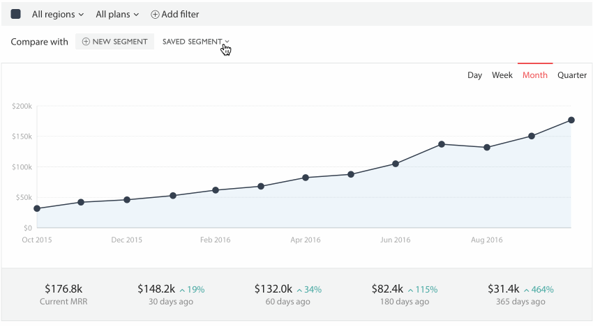
You can select saved segments, or you can create a brand new one on the spot. A key improvement here is that you’re no longer required to save a segment before viewing it.
You can also edit the segments live, drilling down by plan or any other filter that suits your investigation. The graph will reflect your changes immediately. This is all about providing more responsive and flexible analytics.
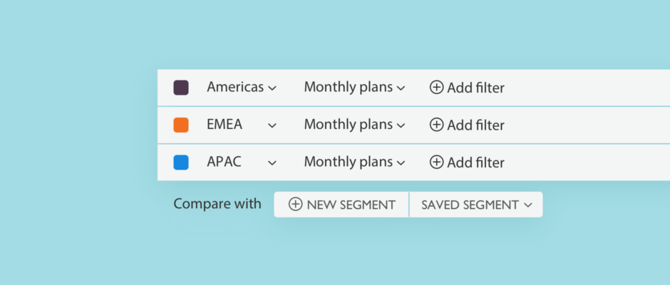
NEW for ESSENTIAL plan: Compare regions and plans on the same graph
Customers on the ChartMogul ESSENTIAL plan can now compare any combination of segments on the same graph. We’re excited to extend this functionality to all users.
BONUS: Colors!
The above updates required that we make comparing multiple segments on the same graph as easy to comprehend as possible. The answer: colors!
Label each saved segment with a specific color. You can also easily edit that color on the spot, switching around on the palette provided.
We’re excited to see what you can achieve with Segmentation. If you have a ChartMogul account, you can log in and start using it right away. If you haven’t signed up yet, you can start a free 30-day trial to start using the features.