
Do we really need another metaphor?
The SaaS industry is ripe with overused metaphors. I’m sure you’ve seen enough leaky buckets and rocket ships in your career. But please allow me to use another metaphor here — I promise it’ll be worth your while.
Blame Kathy Sierra
Or alternatively just buy her excellent book.
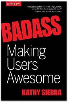
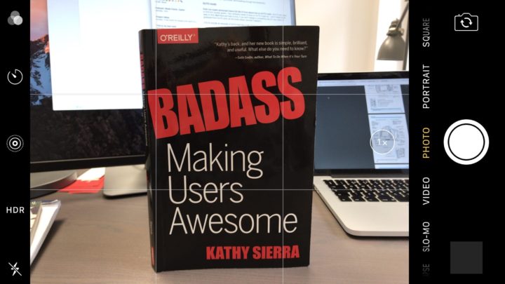
I’ve recently been reading Badass: Making Users Awesome by Kathy Sierra.
In the book, Kathy presents what I think should be the founding framework of any Customer Success organization in a business: The process of achieving true empathy with your customer, and understanding what they’re really trying to achieve. (hint: It’s always something more high-level than “close more deals” or “generate more leads”).
A lot of the examples in the book are based around a comparison with photography, and the process photographers go through to improve their craft. It creates a nice illustration of several concepts that are relevant to B2B SaaS, so I’d like to discuss these in a bit more detail.
Note: Although I’m expanding on them, the majority of the concepts discussed here belong to Kathy Sierra — who deserves all credit.
True customer goals
A camera is just a tool, like anything else. People don’t buy a Canon 5D MkIV because they want the features of that camera, they want to take their photography to the next level and produce amazing images.
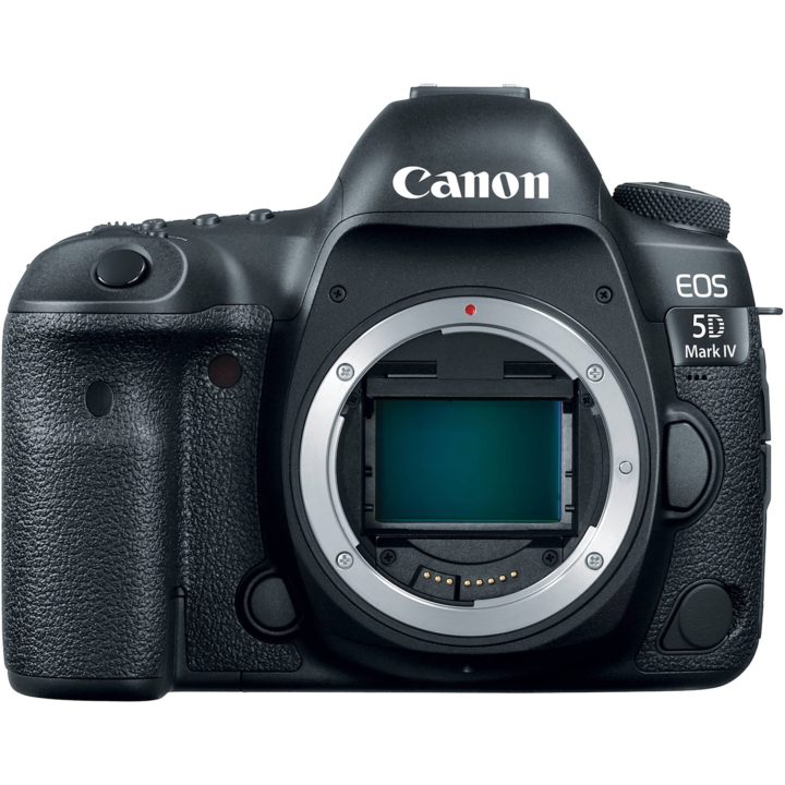
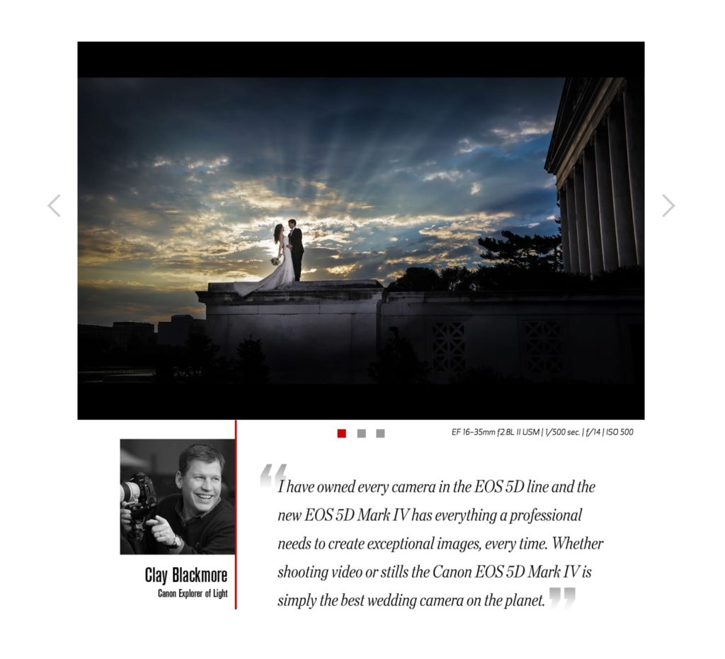
Canon’s Marketing for the 5D is decidedly aspirational. I mean, why not? The best way of selling a camera is clearly to use some remarkable images shot with the camera:
The same principle applies when a customer purchases your B2B software. They don’t want to buy ChartMogul because ChartMogul has some cool features — they’re aspiring to make better, more data-informed decisions to grow their business.
In the book, Kathy outlines the difference between the pre-purchase and post-purchase experience when buying a premium camera. Once you open the box, there’s a sharp contrast between the marketing material that persuaded you to purchase, and the technical instruction manual that falls onto your desk.
“Good Marketing focuses on what the potential user really wants to do. But after they buy? Every experience the user has with us shifts to just the tool.”
– Kathy Sierra
In other words, the Marketing department has solved the messaging here. But for some reason the designers of the actual product UX have not:
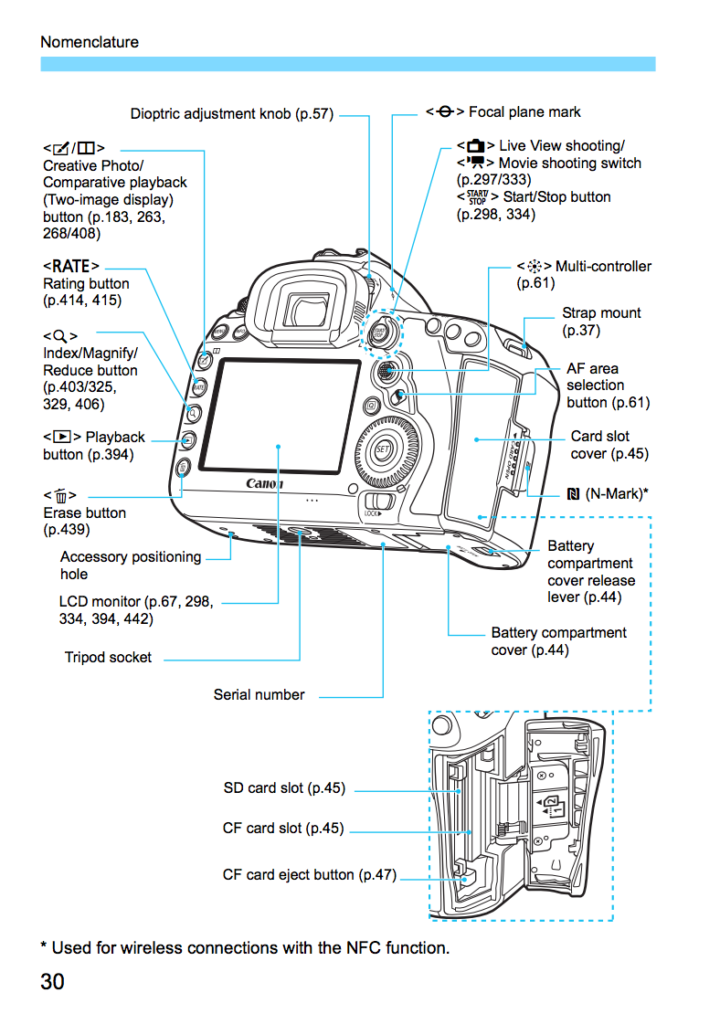
Just to pause for a second, this is where I initially started to feel uncomfortable with the points and examples raised in the book. This camera is, after all, an advanced product. A tool for people with advanced skills in photography to hone their craft.
Should the tool really teach its operator how to be a better artist?
Surely the best thing a manual like the one above can do is tell the operator how it can be operated, in as much detail as possible. Zero bullshit – just let me get on with photographing weddings.
But then I thought about the same dilemma in professional B2B software.
Making users better
Much of Kathy’s arguments revolve around the following statement:
“Don’t make a better [X]
Make a better user of [X].”
This has huge implications when it comes to designing a software product’s UX. If this is our true goal, we’re effectively expanding the scope far outside of what happens when the user is actually interacting with your product.
If we help people make better, data-informed business decisions at ChartMogul, when do you think those decisions get made? Most of the time it’s probably not while they’re logged into their ChartMogul account and sitting in front of the computer. This can be a liberating yet overwhelming way of thinking; suddenly the scope of what we consider relevant to our product is blown wide open!
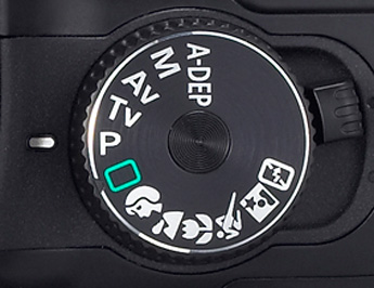
AUTO mode
Even our super advanced Canon 5D Mk IV from above has an AUTO mode. It’s very easy to find (It’s usually green).
Your software needs to have an AUTO mode too – and it needs to be easy to find. But there are risks involved, if you don’t design a natural way for your users to graduate from AUTO (and, as the book states, become “badass”).
A helpful exercise at this point is to define what it actually means to be an expert, in the context of your product. And not just the top-end of the scale – think about the entire journey from novice to expert for your users. Let’s call it The Path To Awesomeness (I actually made this up and will take credit for this one).
The Path To Awesomeness™
Hidden depth is a large component of successful consumer software. Companies like Apple nail this on a regular basis, with just the right balance of feature discoverability and simplicity.
When it comes to business software, it’s often assumed that everything should be exposed to the user at once, because “they know what they’re doing”. That’s a big assumption to make, and more often than not it’s incorrect.
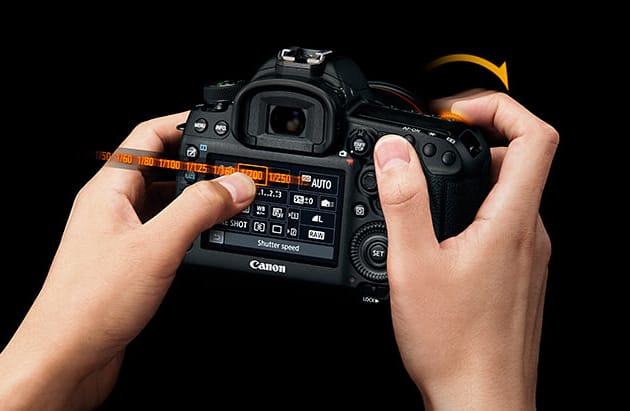
Here’s the most popular consumer camera interface in the world:
And here’s the main interface of our 5D Mk IV:
Have you ever tried handing your iPhone to a passer-by when you need a group photo taken? If so, I’m guessing you didn’t need to explain to the person how to operate the camera.
Have you ever handed a DSLR to a passer-by for the same purpose? Good luck!
The problem is, enterprise software needs to fit somewhere between these two extremes when it comes to exposing functionality. In fact, it basically needs to have the benefits of each, with the drawbacks of neither one:
- It’s easy to pick up and get started, discover features and understand them
- It’s conveniently optimized for experienced “power” users with advanced workflows
And finally, you need to design a way for users to navigate from the first point to the second — along the path of awesomeness.
UX problems in the B2B software space today
People (us at ChartMogul included) talk about Onboarding, i.e. the experience of getting started with a product or tool. There’s a huge amount of effort put into this critical “early life” part of the relationship between your product and the customer, and rightly so.
But one huge flaw in a lot of the thinking around onboarding is that it really only defines a small fixed period in the lifetime of a customer. We think of it as a binary step — the user is either “fully onboarded”, or “not yet onboarded”. This helps us optimise UX, but it doesn’t help us track and improve the learning journey that users go on over their entire lifetime in the product. In other words, onboarding finishes far too early.
5 things you can implement to improve this
1. Design a learning experience that extends outside of app usage
If we really are in the business of making users better, we need to take a holistic approach towards education. What does this mean in practical terms? For me at least, it means:
- Your product should make users more awesome
- Your customer success interactions should make users more awesome
- Your content should make users more awesome
The holy grail here is to have a structured approach across all three areas.
2. Check for contrast between marketing experience and product experience
Have you ever been super excited to sign up for and start using a new tool, only to hand over your credit card details and be faced with constant friction and flaws?
Make sure you’re not offering an aspirational Marketing experience to potential users, only to hand over the product with an accompanying black-and-white manual containing hard-to-read small print (not literally of course).
3. Track users’ path to awesomeness
We’re lucky to have a wealth of tools available to measure engagement and user activity within our software today. And it’s easy to implement.
- Take those points you defined in your path to awesomeness
- Find things within your software that suggest the user has reached those points
- Use event-based behavioural analytics to measure whether the user has reached that point
Record from each point what the user might need to achieve in your app to “level up”. Then take a look at how natural a progression this is in your UX today.
4. Optimise your “blank slate” experience
When the user logs into your software for the first time, what does it look like? It’s really hard to look at this from an unbiased, fresh perspective – you’ve probably seen the screen a million times and can no longer adopt a high-level view. Perhaps test with some other people who’ve never seen or used the software? Do these people have any idea of where to go next, or what to do?
Take this a step further. Look at the state immediately AFTER the user has completed your onboarding. In all likelihood, this will have been given less attention than the first login. Do the same exercise here.
5. Give new users an AUTO mode
You don’t have to make it green if that clashes with your colour palette, but this fallback needs to be easily recognisable and clear to users. And just to emphasise, this doesn’t necessarily need to be a specific “mode” – the goal is to build a whole set of functionality — or mode of use — that just simply works, zero knowledge required. This is your users’ comfort zone, and a place to fall back to when everything else fails.
Final word
Read Kathy Sierra’s book, BADASS: Making Users Awesome! It covers far more than I’ve talked about here, and the concepts inside will change the way you think about designing your product’s user experience.
If you want to go deeper into the elements of SaaS customer onboarding, you should read our post: A Guide to SaaS Customer Onboarding
Finally, I promise I’m done with SaaS metaphors for at least a couple of weeks.