
Optimizing pricing will reduce the friction for your potential customers to purchase your product. One indicator of pricing optimization is the ratio of discounted to non-discounted subscriptions. The lower this is, the fewer discounts you are giving out, and the closer your pricing to perceived value.
Adding attributes
Our integrations automatically detect discounted customers and their location information as recorded in your billing system. The discount and location information is stored in ChartMogul and offered by default as customer filtering attributes. You can learn more about all the default attributes available in ChartMogul here. If you submit data via the Google Sheets App or Import API, you will need to specify the discount amount and geo data in order to use the filters described in this article.
Comparing discounted to non-discounted segments
In ChartMogul, you can easily compare the segment of your non-discounted customers to your discounted customers:
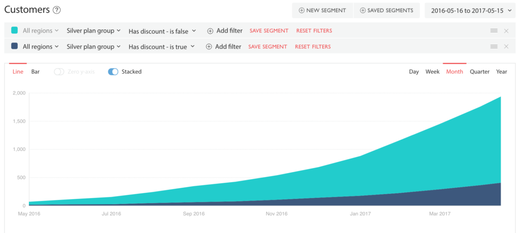
- Select a plan from the drop down and click on filter has discount is false
- Click on +New segment
- Select the same plan and click on filter has discount is true
- Click on Bar and toggle Stacked
What we learned
In this example comparison, we can see that the pricing of the Silver plan appears to be well optimised as the majority of customers don’t have a discount. This indicates that the perceived product value is equal to or greater than the current price paid.
Next steps
To get more granular, we could also add a regional filter to the comparison. If you know that 70%+ of your customers come from a particular region, you might want to filter for that region in order to optimise your pricing for the target group that generates most of your revenue.
Share your analysis
Do you have a particular analysis in ChartMogul that has helped gain unique insights? Do you think it could help other users? Please send it to us at support@chartmogul.com or drop a note in the comments below.