By popular demand…
Our last landing page analysis is still one the most popular articles on ChartMogul. Given that it’s been 18 months since we did that run-down of the state-of-play for SaaS websites, it’s definitely time to revisit the topic. Conventions and trends in website design change rapidly. Big businesses are expected to roll out redesigns to keep their site fresh every few months, while specific UX patterns or trends spread like wildfire throughout the industry once they’re proven to increase page performance (or rather, once someone has blogged about them).
We included all of the 40+ companies from the previous analysis, as well as many more. This time the total is over 100 landing pages, each from the B2B SaaS industry — from smaller startups to big-name brands like Salesforce and Google.
Why the fascination?
Regardless of company size, product or target customer, the landing page is often a user’s first contact with your brand. Even if not, it’s always the canonical representation of your brand and your company’s offering. In an age of large-scale social platforms and advertising, your website is likely to be the one remaining web property over which you have complete control. You define the design, copy, layout and behavior of your site, and it’s for this reason that landing page design is such a huge consideration for every business. Unlike that sponsored post on Facebook or the article you published on Medium, you have the possibility to create a huge advantage through a compelling, convincing landing page that converts users to customers.
So here it is – our updated 2017 landing page analysis!
WARNING: This article is packed with statistics and findings. If it’s a little overwhelming, don’t worry — we’ll be unpacking some of these in the coming weeks.
This post is split up into 8 parts, covering different aspects of B2B landing pages and each featuring examples:
- Navigation
- Page length & scrolling
- The Hero
- The Headline
- The Call To Action (CTA)
- Social Proof
- Video
- Other findings
Browse the landing pages
As before, you can find a collection of every landing page screenshot here on Pinterest:
Part 1: Navigation
Navigation is the backbone of any website. While there are a few different conventions for allowing users to navigate a site, in the world of B2B SaaS, people usually have a single expectation: It’s at the top, and flows from left to right.
You wouldn’t think that this allows much room for creativity when designing a landing page, but the sites included in our study showed some interesting variations on the “norm”.
Why it matters
Navigation is how users orientate themselves when they first land on a website. It defines the core structure of the information presented — which in the case of most SaaS sites includes features of the product, pricing, details on the company itself, etc.
What we learned
Keep the structure simple
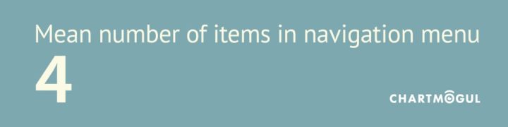
The average number of navigation items in the menu remains identical from our 2015 analysis at 4.3.
Keep the structure simple. There should be no reason to have more than 4-5 top-level navigational links. Things get more complex for multi-product companies, but most tend to include a “Products” menu item to accommodate this.
Avoid hard-to-discover menus
Don’t bury other pages in a ‘More’ item in the menu. This is completely blind for the user, who’s unlikely to click unless they know what to find there. Just 13% of landing pages included this “catch-all” item in the menu. Looking for a good alternative? Including a sitemap at the bottom of the page is a good idea, and helps human navigation as well as SEO.
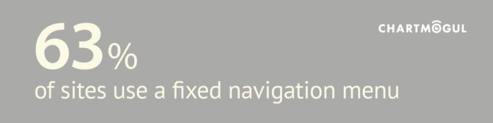
The majority of SaaS landing pages use a fixed (“sticky”) navigation menu. This reinforces a sense of the user’s location in the site structure at all times, and gives them a low-friction way out of the page they’re on, other than closing the tab. However, an increasing number of sites limited the number of navigation links while scrolling, some just displaying a signup button. This results in a Call To Action that’s always visible to the user — which is arguably a more elegant solution than spreading multiple CTA buttons down the length of the page.
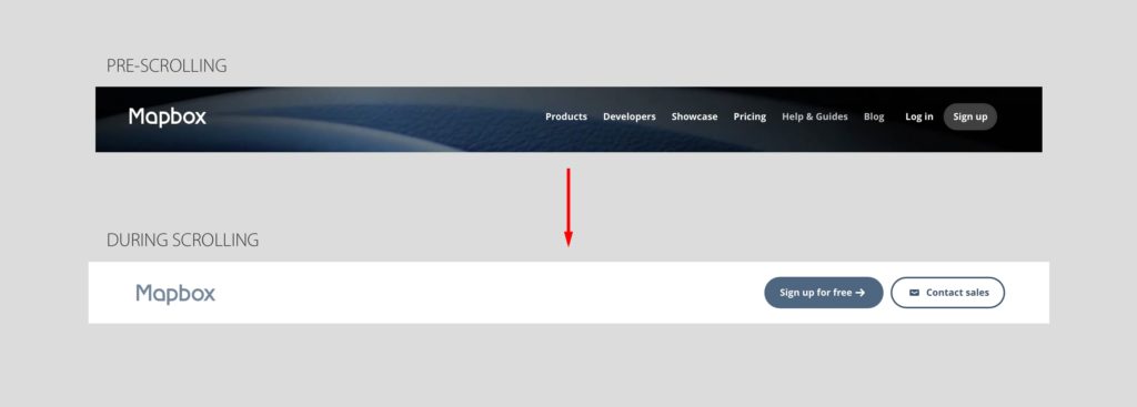
Example 1: Mapbox
Mapbox reduces its navigation while scrolled to just two CTA buttons:
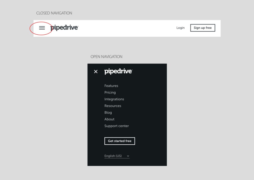
Example 2: Pipedrive
PipeDrive uses the hotly-debated “hamburger menu” for navigation (the user must click the three lines to open the nav menu). This was the only site in the whole study offering this style of navigation on desktop, although it’s far more common on mobile layouts. Perhaps their intention here is to reduce clutter and encourage visitors to scroll on the landing page? Less control for the user, more opportunity for the company to define and push users through the optimal navigational flow.
Part 2: Page length & Scrolling
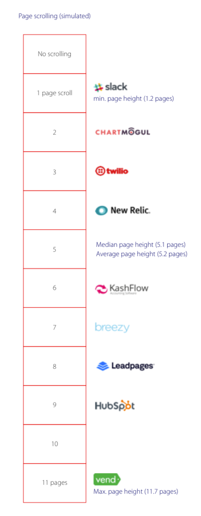
Just as with our previous analysis, we analyzed the page length of each landing page — looking at what this means for user scrolling on a typical desktop screen resolution.
Scrolling is not necessarily bad, however. Various studies have shown that scrolling is a more natural interaction for users — if it’s not clear what to do on a page, generally people will scroll down. Our study shows that companies take different approaches to spreading their content out, some opting for multiple small pages and others fitting all critical product information on the landing page itself.
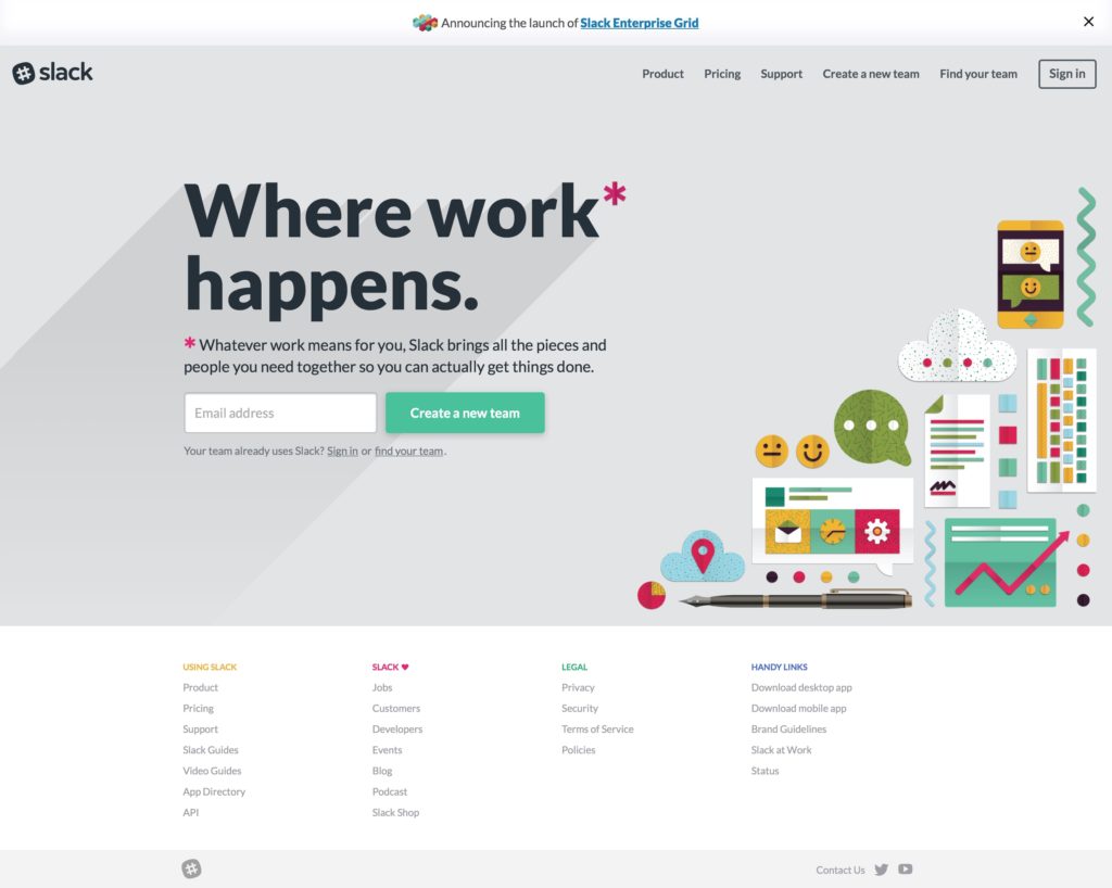
This year we have a different king of (short) page length: Slack!
Here’s a visual overview of the page length data:
Part 3: The Hero
Why it matters
If the landing page is the user’s first impression of your website, the hero section serves as the user’s first impression of your landing page. If you’re going to shock, wow or ultimately impress your visitor, this is the place you need to do it.
What we learned
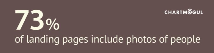
Leverage humans
73% of the landing pages we analyzed showed people — many of these shown within the hero section. Human faces are proven to grab attention, and for a category like SaaS which is not inherently emotional in its nature, this is one of the most effective ways to convey or inspire emotion amongst visitors.
Video is mainstream
53% of landing pages use video of some kind to convey product value to the user as quickly as possible. Videos are proven to be more engaging than images in certain contexts, so it makes sense that more businesses are leveraging the format, in spite of the high cost to create. Even in 2015, studies showed that 4X as many consumers would rather watch a video about a product than read about it. In this year’s study, we saw this taking two forms:
- A big ‘play’ button over the image to get users into the product video as smoothly as possible.
- A silent video background on the hero section, previewing the full product video (which users could choose to play).
Showcase your customers
For the first time, we saw customers showcased in the Hero section, rather than visuals from the product or company itself. This is an interesting strategy which really brings case studies and customer success stories to the forefront. If the product itself isn’t inherently visual (i.e. API-based), leveraging your customers could be a great way to boost user engagement on your site.
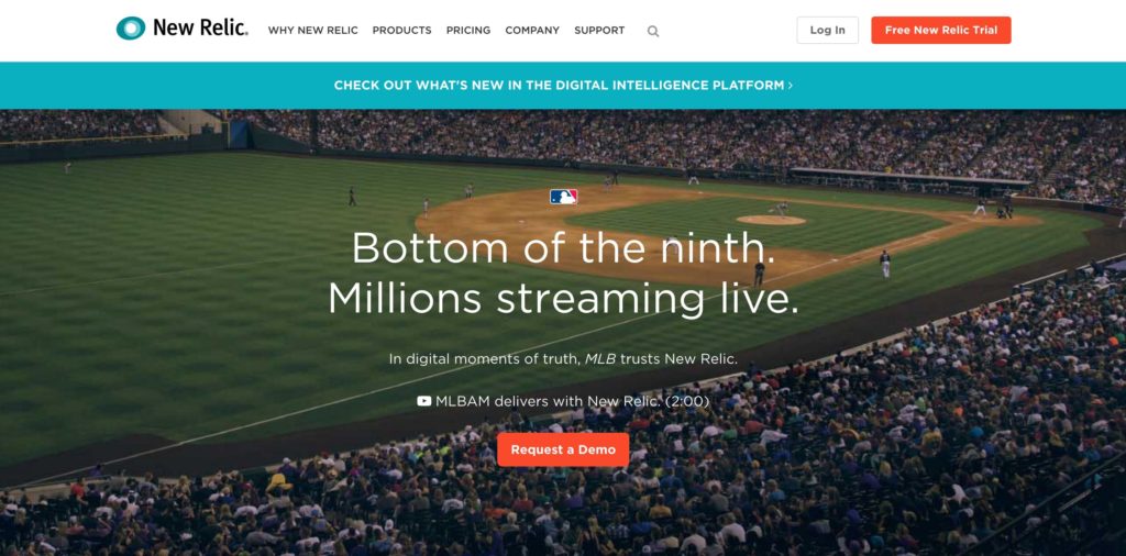
Example 1: New Relic
New Relic has embraced their customer brands in a big way, in the hero. And when you have a brand as big as MLB in your customer base, why wouldn’t you?
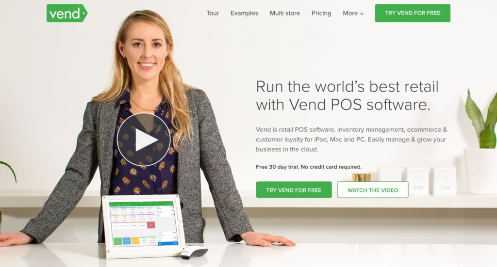
Example 2: Vend
Vend’s intentions are clear here — video-first. The oversized play button is incredibly enticing, and probably the first click for many visitors to the site.
Part 4: The Headline
No hero is complete without an accompanying headline. The headline (usually one sentence) is basically your initial product pitch, and needs to grab attention in the same way that the image does. So how do you grab attention with copy? We saw a few different strategies in our analysis:
- Simply state what your product is, e.g. “Simple design, prototyping and collaboration.” (Marvel)
- State what your customer can do with your product, e.g. “Get ready to sell Smarter, Better, Faster.” (Zoho CRM)
- State something aspirational and/or provocative to grab attention, e.g. “Powering Subscription Success” (Recurly)
- (NEW) Outline the problem your product solves, e.g. “Help desk software isn’t helpful anymore.” (Kayako)
From our data, Number 2 is by far the most-used type of headline. In 2017 it’s common knowledge that telling people what your product does is less effective than telling them what they can do with your product. Or as was very eloquently stated:
“People don’t buy products — they buy better versions of themselves.”
(and just for tradition’s sake, here’s the over-used Mario analogy).
What we learned
The average headline length (6 words) remains almost unchanged from our last analysis. What we did see however, is some more creative uses of language and page design to stand out from what is widely-accepted as the standard for most sites.
Here’s a word cloud representing frequency of words in all of the headlines in the analysis:

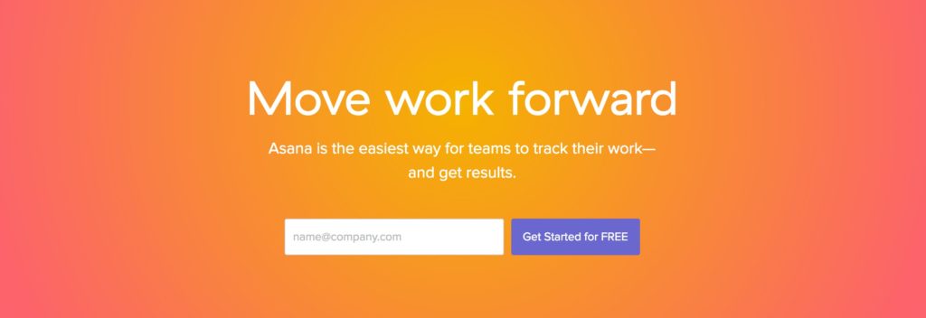
Example 1: Asana
I love this headline from Asana. At just three words, you’d think it would be too vague to convey the product’s true value (so many businesses end up with “grow your business”), but it still gives a sense of what Asana the product is about: Reducing friction, organizing teams to get work done. It also conveys all of this in a positive light — the notion of moving forward is always positive.
Example 2: bridge
Bridge are doing something that is increasingly popular in landing page headlines — they use animation to morph the headline and play on an overall theme that fits the value of their product. In this case, the value is “getting smarter” (it’s a learning platform) and they’re highlighting how each role does better at their job when they’re “smarter”.
Slack jumped on this fairly early with their “A messaging app for _______ “ scrolling headline (which is no longer used).

Part 5: The Call To Action (CTA)
The Call To Action (CTA) is the one action that every single element on the landing page is trying to get your user to take. Clicking a CTA indicates that the user has made a choice — either that they want more information or they want to sign up — it’s represents a definite “win”.
What we learned
Given that the CTA is such a pivotal part of any landing page, it’s obviously the object of a lot of debate. The key decisions are:
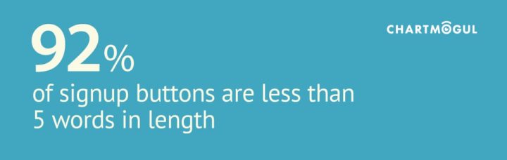
- What text to use (hint: Over 90% are less than 5 words in length)
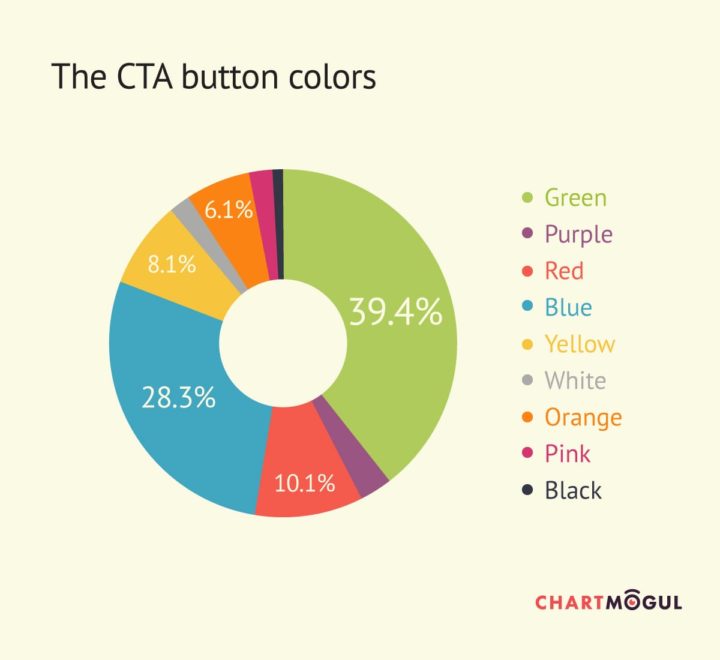
- What color to use (hint: Nearly 70% of all CTAs are green or blue)
- Where to place it (hint: Many sites duplicate the primary CTA or make it ‘sticky’)
The above decisions, given so much multi-variant testing of sites today, are not as difficult as they used to be. For the text, the most successful CTAs reflect the action that the user is taking by clicking the button, as explicitly as possible (while also remaining brief in length). “Sign up” is not as explicit as “Sign up for free 2-week trial”.
Don’t ignore the data
CTA button color must be one of the most split-tested web page variables in history. Our data shows a very clear preference towards green or blue. Again, these are colors that are proven to have a positive effect on users, psychologically. Green is filled with positivity, while blue is calming:
Use secondary CTAs for Enterprise
In many ways, having a secondary CTA next to the main one breaks many of the rules of CTAs: “There should be one and only one action that the user can take.”
What we’re seeing this year in SaaS is the rise of a second (usually less prominent) CTA next to the trial signup, allowing users to request a demo.
The goal is to catch those users who are, for whatever reason, not ready to do a self-service signup, but want to have a discussion and see more of the product. Typically, enterprise customers are not likely to self-sign-up, so this strategy effectively adds an “I’m Enterprise – please sell to me in the way I’m accustomed to” button.
Inline forms smooth the signup friction
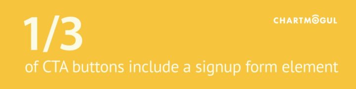
A bigger trend we see this years is the decision to bring part (or all) of the signup form onto the landing page, next to the CTA. In other words, the user needs to enter some information as well as clicking the button on the landing page. You’d think this adds friction, right?
What businesses are discovering is that asking for some information upfront has the following effects:
It takes some friction from the next steps of the signup, and adds it to the first step. This does make the initial CTA harder for users to complete, but it smooths out the signup flow — they’re less likely to be overwhelmed with a huge form further down the funnel.
If the user drops out of the sign up flow, you at least have them as an email lead. This is huge! Similar to abandoned shopping carts in eCommerce, a user who’s filled out their email and clicked the initial CTA (only to close the tab) CLEARLY has a strong interest in your product. With this method, you’ve got that person’s email — and therefore a well-qualified lead that you know had strong intent to purchase. Nurture away!
We found that the majority (over 60%) of CTAs with inline form fields had just one field — the email. Many sites also went to the other extreme of capturing probably all the information required on the landing page, with six, seven or more form fields. This has the benefit of giving the user their account right away, without any further steps.
The main learning here? Designing a signup flow is a game of balancing friction. Take it away from one step, you’ll probably have to add it in another step. It’s worth questioning whether you need all those form fields at all, or whether you can capture the information in other ways.
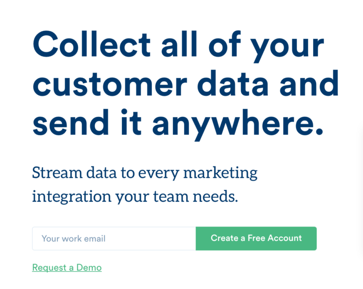
Example 1: Segment
Very solid CTA from Segment — captures email upfront, specifically requests “work” email, and has a fallback “Request a demo” secondary CTA.
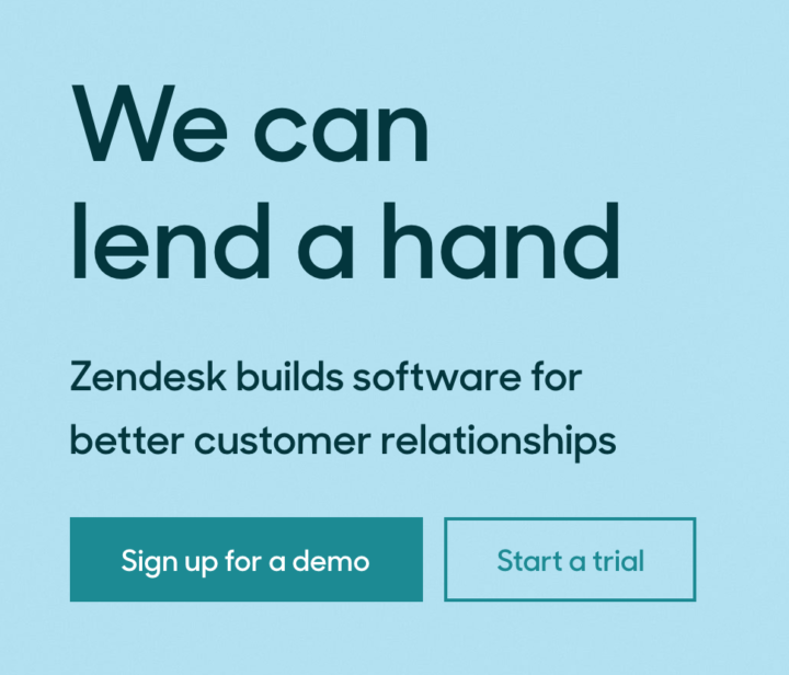
Example 2: Zendesk
Zendesk’s latest rebranding comes with a clean visual style, which is echoed in the sharp copywriting across the site. Notice that the “demo” option is actually the primary CTA here, with the trial signup relegated to second place. This without a doubt reflects a push to onboard bigger accounts through their sales process.
Part 6: Social Proof
Social proof comes in a few different forms on landing pages:
- Customer testimonials (quotes)
- Links to case studies / customer stories
- Customer logos
- Social media embeds
The purpose of social proof on a SaaS website is to remove hesitation and promote confidence in the user. The presence of recognisable brands or highly-positive quotes tells the user that they’re in good company — “if THIS successful business I respect uses X, it must be a quality product!”
The strongest form of referral is word-of-mouth, and if done right, social proof can feel just a step away from that in effectiveness.
The problem, of course, is that with every hopeful SaaS business pasting the logos of successful companies across their landing page, users might develop “blindness” to this technique.
What we learned
We’re becoming logo blind
Customer logos are now often placed without any explanation. This reflects people’s familiarity with the technique, making the assumption that these logos are in fact customers.
A word of warning: Some businesses have been shown to “fake it before they make it” and flat out lie about their customer base. Putting logos without explanation or linking to more detailed information on the customer puts you into the category of potentially faking your social proof.
Possibly as a result of this, more businesses are making social proof a much deeper experience for users — some companies are putting their customer stories front and center on the site, with accompanying videos, podcasts and case studies taking center stage — sometimes ahead of product information (See the New Relic example in the Hero section above).
Example 1: User Testing
User testing use a fairly-typical bar underneath the hero, featuring some strong customer brands. What they do incredibly well is link through to a full Customer page complete with compelling customer stories, which really reinforce how they help those businesses succeed.
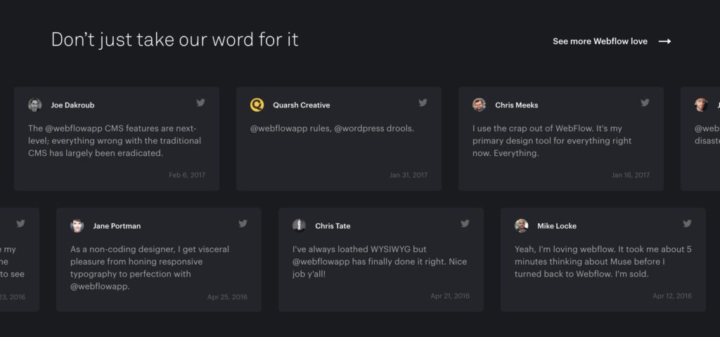
Example 2: Webflow
The team at Webflow have done a great job of leveraging social proof — particularly from social media. The language is strong here too, telling users not to “take our word for it”, and to check out the real feedback from real people. Displaying tweets in a native-feeling UI rather than plain text quotes reinforces the feeling that these are real comments.
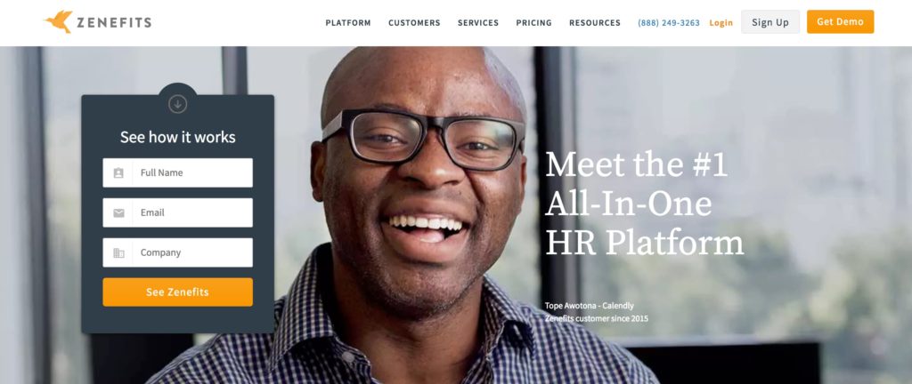
Example 3: Zenefits
Similarly to ProsperWorks, Zenefits is leveraging their customer base at the forefront of their landing page. No product screenshot here – just a big smiling Tope Awotona of Calendly! A quote would have been nice here.
Part 7: Video
All data points and research on the use of video in Marketing suggest that the format wins hands down against static images. It’s considerably more expensive to create than static imagery, but with improved tooling and technology, that cost is coming down, to the extent where most startups can create a professional-looking demo video.
What we learned
We saw an increase in the number of sites using some form of video on their landing page this year – from 46% in 2015 to 54%.
We saw video used for:
- Silent video backgrounds for the hero section
- Product demo videos
- Company culture or vision videos (perhaps more useful for hiring?)
- Customer testimonials
However, the biggest noticeable change with regards to video was the placement. Landing pages today are putting over-sized play buttons front and center in the hero section. This suggests that the video is intended to be the first element of interaction when the user arrives on the page.
From a purely anecdotal perspective, this makes sense to me. If I visit the website for a product or service and there’s a video available on the page, I’ll usually jump straight to playing it.
From a Marketing perspective, video is an incredibly information-dense medium. You can convey a whole product, company, vision in a 30 second video, where it would have taken you a 10-page website with 25 clicks and tons of scrolling to convey the same level of information.
Warning: Video is nuanced. There are subtleties that you’ve got to get right, to give the impression you’re aiming for. There’s a knife edge between seeming inspiring and professional and being amateurish and arrogant.
Example 1: ProdPad
When you land on the ProdPad website, the play button is right there. It has no explanation, and that’s fine — we know exactly what’s going to happen when we click it. In this case, the resulting product video is well thought out, simple and uplifting.
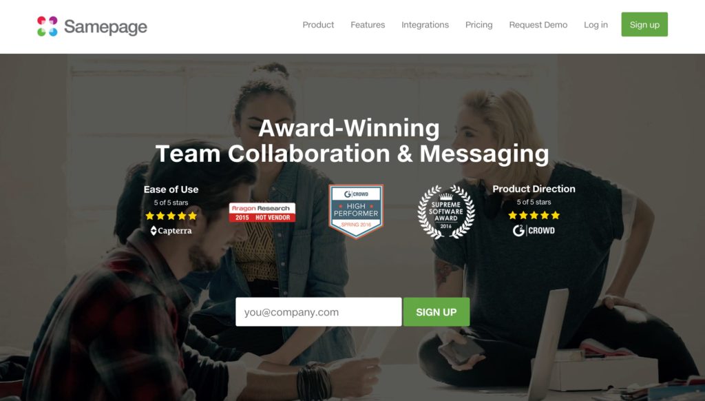
Example 2: Samepage
Samepage uses video in a different way. Their full-width video background on the hero section doesn’t explain the product, and obviously doesn’t have sound. What it does (and quite effectively) is set the tone for the theme of the product — team collaboration. It’s also a more effective way of using human faces to engage the user (even more than static imagery).
Part 8: Other findings
Content belongs everywhere
In 2017, content is leaking from the blog to other parts of company websites, including the landing page. An increasing number of businesses are using small sections of their landing page to highlight recent content (can be downloadables, articles, etc.). This has a couple of key benefits:
- Keeps the landing page feeling dynamic, if recent content is regularly updated
- Helps with lead capture (in the case of “lead magnet” content that requires email signup)
- Helps establish the business as more than just a “product”, but also a thought leader in the space.
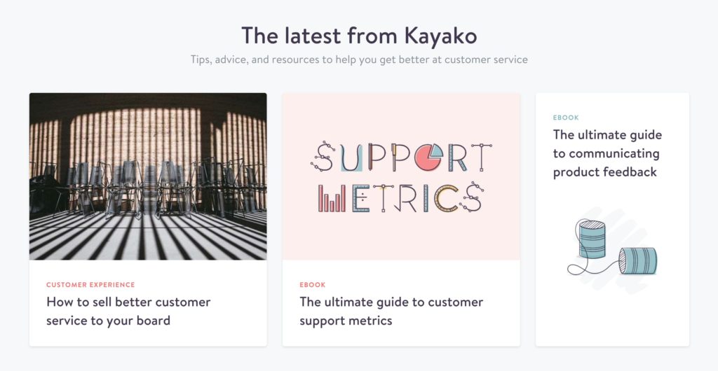
Here’s a brilliant example from Kayako. Their content gets a whole section on the landing page, demonstrating how they’re dedicated to helping educate people on the topic of customer service:
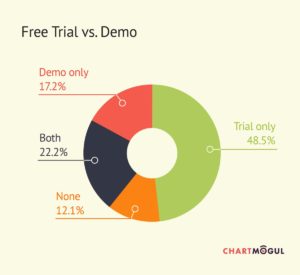
Free trial vs. demo
Product demos (whether video or in-person) feature much more prominently this year on landing pages. As mentioned in the Call To Action section, there’s often a secondary CTA button for booking a demo, alongside the trial signup. Sometimes there’s no trial at all — only a demo!
Obviously this is closely tied to the product itself, and the segment of the market they’re selling to. It is interesting however to see that less than half of landing pages offer just a trial alone.
Check out the data on this here:
The death of the full screenshot?
Our last study saw an overwhelming number of “device” screenshots, where the full product screenshot is wrapped in a sleek looking (usually Apple-esque) device such as a laptop or smartphone.
One trend we’ve seen in this year’s landing pages moves away from full screenshots, and focuses on extracting small elements of the user interface to showcase individual features and interactions. The technique is often done in a stylistic way, to emphasise or even abstract away from the real interface.
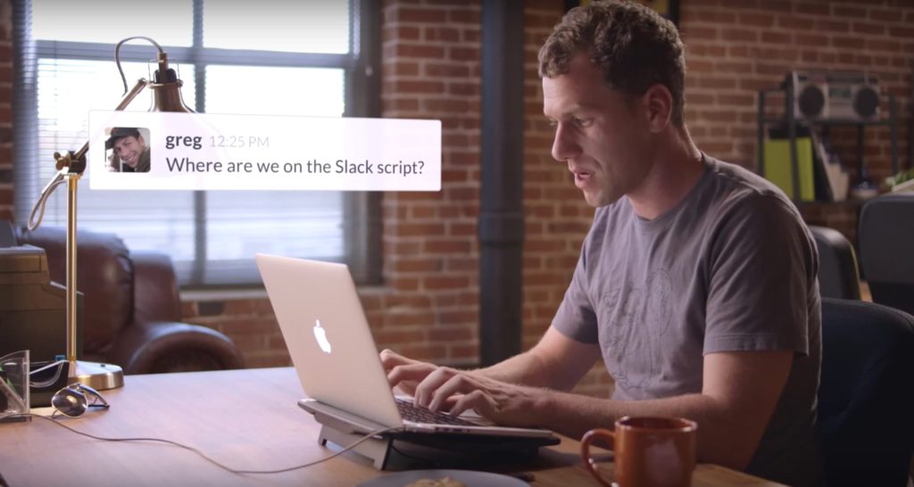
I’m sure they weren’t the first, but Slack popularized this with their trendy product video a couple of years back:
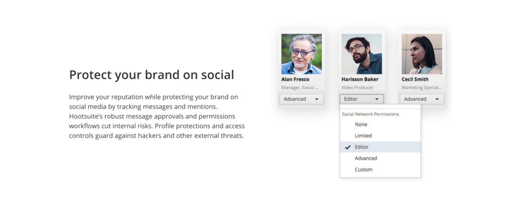
…And now we see an increasing number of landing pages highlighting small interactions in their UI, in a more isolated way. For example, HootSuite:
Appendix: Data points
- Mean number of nav bar items: 4.3
- 63% of sites use a fixed (sticky) navigation menu
- 30% of landing pages use a chat widget
- Mean headline length: 39 characters
- 46% of CTA include the word ‘free’
- 44% of CTA use uppercase text
- 34% of CTA have an inline form element
- Median no. of inline form fields: 1
- 92% of CTA buttons are less than 5 words in length
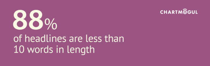
- 88% of landing pages headlines are less than 10 words in length
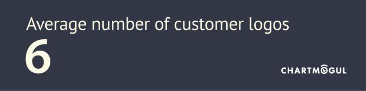
- Mean number of customer logos: 6
- 73% of landing pages include photos of people
- 53% of sites are using video