
Before we get started, let’s address the elephant in the room: Cohort analyses aren’t exactly a SaaS metric. But when it comes to the tools and visualizations at your disposal for growing your SaaS business, cohorts are an essential piece of the puzzle. A cohort analysis enables you to observe how a specific group of customers (a cohort) evolves over time. Understanding user behavior over the course of a customer’s lifetime helps you optimize everything from plans and pricing to product features.
Definitions
“A cohort is simply a fancy name for a group.”
David Skok
A cohort is, as Skok suggests, just a predefined grouping of your customers. In reality, when analyzing cohorts for a SaaS business you’re likely to be grouping by date of signup. We call this a time-based cohort analysis. For example, your cohorts might look something like:
- “Signed up June 2021”
- “Signed up July 2021”
- “Signed up August 2021”
The reason for this grouping is that it gives us a good segmentation that can show us trends in behavior over time. That “Signed up June 2021” cohort will always remain, and you’ll track their journey as a user of your product. There are other ways to group cohorts for analysis (grouping by segment or size), but time-based cohorts are by far the most common approach in SaaS.
A cohort analysis is a visual chart for plotting and comparing the progression of specific metrics for each cohort over time. For example, typically in SaaS we would look at the progression of retention rate, plotting retention values for each month following the cohort’s creation. Cohort analyses also allow us to directly compare cohorts to each other — by lining up the starting date of each cohort.
Why are cohort analyses useful?
“One of the most important tools to better understand the usage of a web application – or a service, a game or a mobile app, it doesn’t matter – is a cohort analysis. In fact, it’s almost impossible to get a really good understanding of a service’s usage without looking at activity and retention numbers on a cohort-by-cohort basis.”
Christoph Janz, Point Nine Capital
When growing a SaaS business, it’s critical to identify and target problematic points in the customer lifetime. Cohort analyses allow you to do exactly this. Rather than looking at high-level metrics for churn or retention, it’s possible to zone in on the specific months and focus your retention efforts accordingly. Consider which statement is more actionable:
- “Our customer churn rate is up by 2%.”
- “Customer churn rate is significantly higher in month three of the customer lifetime.”
In the second example, you can focus efforts on understanding what’s happening in month three, engaging with customers at that point in their lifetime and applying additional customer success resources.
Note: Cohorts only really work well with monthly subscriptions (or shorter time intervals) and it’s very important not to mix annual subscriptions into your monthly cohorts.
How to read a cohort analysis
The most common form of cohort analysis is presented in table form, with a few standard characteristics:
- Each row represents a cohort of users, with the name of the cohort in the first column (e.g., “Feb 2014”)
- Each column represents a month following the cohort’s creation (month zero being the month of signup).
- The value in each cell is typically the churn rate or retention rate relative to the previous month.
Why are some of the cells blank? Because these cells reference a point in the future!
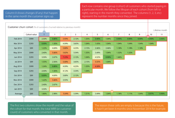
This chart type is extremely useful for quickly identifying problematic months with respect to churn or retention. The color shading (green = low churn, red = high churn) draws our eyes to the problem areas immediately. In this example, month two was showing a spike in churn for earlier cohorts, but appears to have improved from the August 2014 cohort onward.
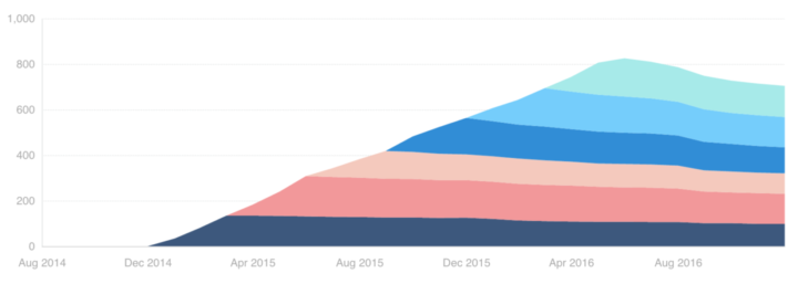
It’s also possible to view a cohort analysis as a stacked line chart:
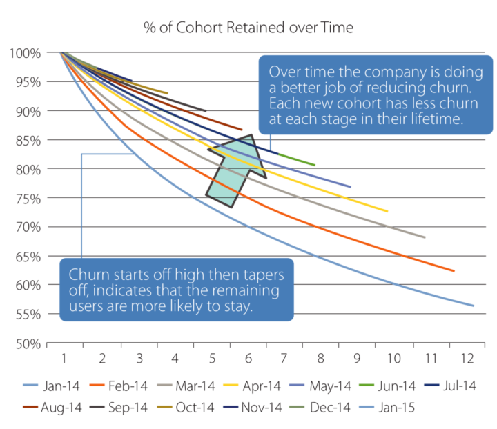
And finally, a “hanging ribbon” chart as demonstrated by David Skok. This chart type does a great job of demonstrating the non-linear characteristics of customer churn:
Taking cohorts to the next level
The key to a meaningful cohort analysis is segmentation, which can give you a highly specific, more actionable insights to base your decisions on. In SaaS, it can be useful to segment cohorts by pricing plan. Typically, each plan will have its own characteristics in terms of churn and retention. Segmenting your cohorts will help uncover this, rather than simply looking at high-level metrics. You can also segment by geographical region, customer characteristics (size of company, etc.) and many more attributes!
Resources and Further Reading
DOWNLOADABLES
The Ultimate Cohort Analysis Cheat Sheet (ChartMogul) — Our comprehensive cheat sheet on performing and interpreting cohort analyses. Print a copy and keep it handy!
BASICS
Tips & Tricks: Creating a cohort analysis to understand user acquisition (ChartMogul) — This post walks you through a practical example of a specific cohort analysis use case in ChartMogul.
Cohort Analysis (ChartMogul) — An in-depth guide on working with cohort analyses in ChartMogul.
DEEP CUTS
Cohort Analysis: A (practical) Q&A (The Angel VC) — SaaS VC Nicolas Wittenborn covers the finer points of building your own cohort analysis in this useful Q&A post.
Make trial-to-paid conversion rates meaningful with Cohorts (ChartMogul) — A specific use case where cohorts can help you understand trial-to-paid conversion rates.